It is important to keep your booking widget clean and tidy - free of superfluous information and allowing your guests to make an informed decision.
If you have a special menu, rather than adding a long narrative to the Special Offer button (which makes it very difficult to read - most people now use mobile phone to make their reservations, so keep in mind the restricted space available on a phone screen - and minimize the amount of scrolling up and down your guest needs to do in order to complete their booking.
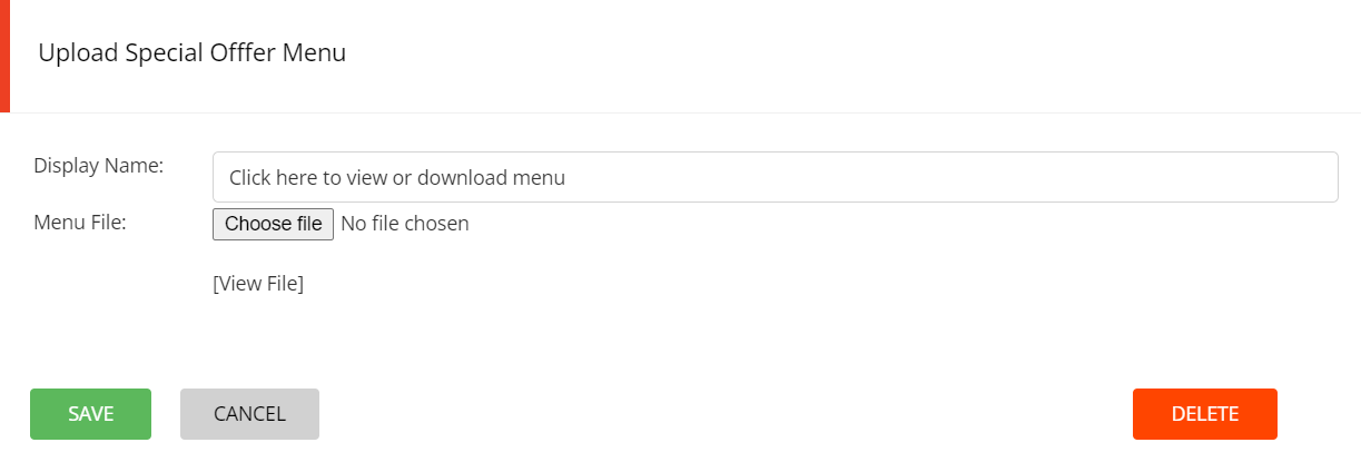
When you create a Special Offer, simply add a pdf of the menu / flyer to your Special Offer button.
Click on the Add file icon at the front of the offer


The offer now displays a pdf icon at the front.

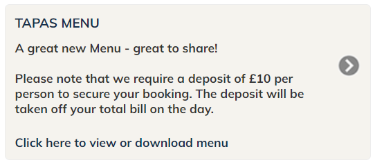
When the guest clicks on Click here to view or download menu, the pdf will open in a new window - this can be viewed or downloaded for later viewing.
Notice how clean that button is - free of unnecessary text and only with the relevant information to help the guest make an informed decision.
What should be on that button?
